|
|
Post by rob2218 on Dec 1, 2007 5:51:42 GMT -7
man...it's a bit...well. it's neat but....for reading purposes.....the bike JPG background gets in the way.
|
|
|
|
Post by btroxl on Dec 1, 2007 6:45:43 GMT -7
I have to agree. I think this is a great site, and the pick of the bike looks good but its a bit hard on the eyes while trying to read threads.
-Brian
|
|
|
|
Post by airdreams1 on Dec 1, 2007 13:24:04 GMT -7
Just too boring being plane white.
Im up for suggestions.
|
|
|
|
Post by robe338 on Dec 1, 2007 17:30:18 GMT -7
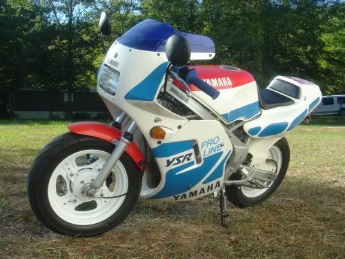
You could do a dark blue background. Gray boxes. black outlines. orange white and blue text..... just kidding I think its fine just the way it is. The only real suggestion I would make is change the bike pic to this one:  |
|
|
|
Post by speedr on Dec 1, 2007 20:56:59 GMT -7
Just too boring being plane white. Im up for suggestions. I agree with plain white being too boring! Personally I think its easier to read on this board than ysr50.com, espcially when its white and grey  . The contrast between the text and background make viewing easy on this site. I suppose for the background you could use 1 solid picture as to not distract readers  and possibly use a blue or purple outline rather than green  . Seems cool to me.. Did that article help you with hyperlinks and search engine results? |
|
|
|
Post by airdreams1 on Dec 1, 2007 22:21:12 GMT -7
Havent had time to read it all yet.
|
|